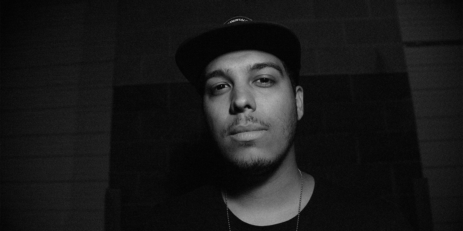
It’s impossible to know how creative aptitude will turn out. That’s something that lettering artist and designer Richard Damm, knows all too well.
The Long Island-based artist specializes in creating conceptual designs using stylized, textured lettering. While the fonts he uses can be easily grouped along with most standard typeface classifications, Rich has a secret up his sleeve: He creates fonts almost entirely from his imagination and builds them into his artwork.
It’s a valuable skill — especially since Rich never wanted to be a letterer in the first place.

Unintended directions
Rich comes from a family of creatives. From parents and siblings to extended members of his family, everyone in Rich’s life was always working to create something — including his grandfather, who was a lithographer and owned a print shop.
But that wasn’t what Rich wanted to pursue at the time. He had his eyes set on something more... heroic.
“I was always drawing as a little kid,” Rich explained. “I was super-into comics. My older cousin got me into comics at a really young age, so I was always drawing my favorite characters and things like that. I was traditionally going to be a comic book artist. It’s what I wanted to do when I was really young.”
A skateboarder in high school, he often found inspiration in logos from skate brands and used them as a jumping-off point for his own creative work. When he started to share his illustrations, he found that the lettering was the first thing that his friends and classmates would point out.

“They would see some of the drawings and sketches that I would do for certain designs, and I’d have lettering in there and they were like, ‘Yeah, you should definitely try to letter or get into some kind of hand-lettering thing,” Rich said. “I was very against it for a while. I didn’t want anything to do with it.”
At the time, Rich had other things on his plate. He was in a band, and he had his eye on the Coast Guard but decided at the last minute to consider a college track and instead attended Farmingdale State College, where his professors heavily influenced his artistic process and creation by emphasizing the need for starting with hand-drawn sketches.
For Rich, starting with a sketch made by hand isn’t just a cornerstone of his creative philosophy. It’s also key to his brand and something that he feels sets him apart in today’s modern era of digital artwork.
Handmade gone digital
Of course, even handmade lettering needs a digital conversion before it reaches Rich’s fans on Instagram. That transition from handmade to digital platforms was one of the most off-putting things that Rich experienced while in school.
“It was scary as hell, honestly,” said Rich.
Coming out of high school, Rich had taken a few classes in digital artwork but that was never his focus. Even when he started to consider a college track toward art and design, Rich never thought he would actually become an artistic professional. The switch from the drawing classes that he was comfortable with to a digital format was a hard one.
“I didn’t even have the programs at the time. I really had to hit the ground running and learn how to use the programs on top of finding my style and continuing the stuff that I really wanted to do, which was drawing and painting with my hands.”

Despite his misgivings, Rich figured the software out — enough to do his homework, at least — but he struggled to find the middle ground between his preferred, hand-drawn style and the digitized formats that he was expected to implement into his creative process.
To solve this problem, Rich turned back to his roots: Skating and music. He started following the artists who would design for the brands he loved and began to figure out their workflow. His choice to study brand artists not only helped Rich develop his own, personalized process — it also connected him with designers and artists who inspired him.
“One of my influences definitely has to be Jon Contino,” Rich explained. “He’s one of the biggest designers on the scene right now. We’ve had a very similar upbringing and cultural background.”
Looking into how Contino created his designs, Rich found a way forward in his own work.
Like art, like music
Through it all, Rich believes that art, like music, conveys a message that brings people together. He wants people to relate to his art in the same way they might relate to a good song.
“With everything that I create, the meanings that I want are the things that are morally correct,” Rich said. “They’re things I truly believe in. So if I’m having a rough day and I put up a picture that says, ‘Mondays Suck’, it’s really a way for me to depressurize and vent about whatever it is I’m going through. At the same time, I’d like someone to see that artwork and think, ‘Oh, yeah! Me, too!’”

In many ways, Rich’s own artwork is a reflection of how he sees the world. Slaves to the Device, Rich explained, turned into a commentary piece from his own experience in trying to keep up with modern design trends and realizing that he was spending more time with his phone and the Instagram algorithm than with his sketchbook.
That piece helped Rich refocus on the messaging that he wanted to put out into the world. Rich says that his positive messaging comes from his friends and family who are constantly lifting him up. He feels like the only way to pay that kindness back is to pay it forward.
“Art has such a strong resonance through everyone, no matter what kind of creative you are. Even if you’re not someone who writes or paints or draws, I think everyone can feel the passion that goes into those types of art,” Rich said.
Learning never stops
Though Rich has a passion and a process, he’ll be the first to say that the learning never stops. Rich is always surfing the web for new design trends. He keeps an eye on everything from product labels to sketches and experimental mockups from influencers within the design community for unexpected changes.
As a designer, Rich always tries to find inspiration through non-traditional methods. While he reads books and watches YouTube videos, he also tries to look at other forms of artistic content, from fresh music to the craft brew scene.
He suggests that anyone looking to get into lettering do the same.
“Look at everything,” he said. “Start tracing cool lettering that you see on a magazine cover. Buy the magazine and buy tracing paper. Do it over and over again. I know that’s cliche, but that’s what makes you better.”

Rich points out that finding something that works for you — finding something that’s inspiring to you and doing it over and over again is the only way to improve. For him, it started with skateboard logos, comic books, and album covers.
But, Rich says, staying true to your interests is a key factor in growing as an artist and in creating genuine artwork that you’re proud to share with the world.
---
Rich Damm is a Long Island-based lettering artist and designer who uses handmade lettering to create genuine and meaningful messaging for brands and clients. You can find his work on Instagram.

