


Interested in hand lettering? You’ve come to the right place.
Hand lettering is a skill that can be easy to learn but difficult to master. To achieve lettering mastery requires a working knowledge of typography, design, and letterforms.
This guide is here to talk you through the basics of creating beautiful, hand-lettered art and to provide everything you need to know in order to improve your lettering skills.
Let’s jump right in!
#toc#

01. The basics
While we don’t want to put too fine a point on it (see what we did there?), it’s important to know a little about hand lettering before you get started.
Hand lettering isn’t a study in calligraphy or typography, though both are closely-related and fall under the broader “lettering” umbrella. Any knowledge you gain in any of these disciplines can help you improve your lettering skills and establish your unique style as a hand lettering artist.
While we’ll touch on the different styles of lettering and get into the details about upstrokes, downstrokes, and everything in between, let’s start with a few basic questions.

What is hand lettering?
Simply put: Hand lettering is the process of drawing letters rather than simply writing them. This is an open-ended definition because the line between hand lettering and other lettering disciplines is roughly defined.
Traditionally, lettering that is drawn by hand and that is created without using digital tools is considered “hand lettering” — but that definition is soft and rapidly changing.
With the advent of digital tablets and related accessories like a stylus and/or artist-focused screen protector, many hand lettering artists have broken away from traditional tools to work in digital formats.

Can I learn hand lettering?
You absolutely can! Unlike more traditional or rigid art forms, hand lettering is very fluid and accessible.
The rules surrounding lettering aren’t as strict (although there are many best practices to help you improve as a lettering artist), and the recent resurgence of brush pens and digital tools have made it even easier to break into the lettering game with minimal experience.
What’s more: There are a ton of great resources available for free or for a very low cost. We’ve listed some of them in our resource guide for lettering artists, but you can find lettering tutorials, practice sheets, books, and detailed beginner’s guides with just a Google search or two.

Are calligraphy and hand lettering the same thing?
Nope, although they’re often grouped together, along with typography, under the “lettering” umbrella.
As a rule, both traditional and modern calligraphic styles follow a more rigid creation process. The art form, the tools (down to the nib), and the creation process are well-defined within this medium.
The key difference is this: Hand lettering is about drawing letters. Calligraphy is about writing letters.
If that’s not immediately clear, don’t worry. Here are examples from two great artists to help you see the difference:
In the above examples, note how lettering artist and designer Emilee Rudd draws out the letters in her design. While they are part of a larger illustration, they’re also drawn into the image as if they were part of the artwork itself.
On the other hand, calligrapher Myriam Frisano is implementing modern calligraphy techniques to create art by writing the words directly onto the page.
It’s important to note that while these are considered to be two separate disciplines, many creative lettering artists are fair hands at calligraphy. The basic hand lettering techniques you’ll need to learn in order to draw clean lines are applicable in both art forms.

What hand lettering tools do I need to get started?
To get started with traditional hand lettering, you’ll need the following:
- Pencil.
- Paper.
- Eraser.
- Ruler.
- Marker.
Depending on the hand lettering style you want to pursue, you might also need additional tools like protractors, brush pens, paint, watercolor kits, and more. (We’ll also cover this in greater detail in the next section.)
You should also consider that the tools listed above are only one approach. If you have an iPad and an Apple Pencil at your disposal, you already have everything you need to get started with digital hand lettering.
In that case, all you’ll need to get started is an app. Check our creative resources guide to find an app that works for you. Don’t forget to look a little farther down our resource list for digital resources — including YouTube channels and step-by-step tutorials from professional letterers — to help you succeed!

Can I make money with hand lettering?
Definitely. Hand lettering, like modern calligraphy, is just one set of skills in a designer’s toolkit!
Many of the professional creatives in our inspiration list use lettering in combination with other artistic and design skills to create incredible art.
If you want to focus primarily on the art of letterforms and everything surrounding them, you can also earn income as a workshop instructor or author like Shelly Kim.
Other artists, like Karin Newport, earn income by creating resources like digital lettering brushes, practice sheets, and more for the lettering community.
Thanks to the recent boom in lettering and the resurgence of hand lettering in a digital format, there are opportunities for creatives with an entrepreneurial streak to master this skill, build an audience, and provide content and resources to the community at large.
02. Hand lettering tools
Every hand letterer needs the right set of tools to refine their lettering technique. Below, we’ll cover the basic tools that you can use to get started with hand lettering.

Essentials
Whether you’re an amateur or an expert, these tools are essential for hand lettering.
If you’ve done any kind of art in the past, you probably have these lying around. If not, don’t sweat it. When you’re just getting started, use what you have available but plan to upgrade as your skills progress.
Pencil
Your pencil is important as both as a sketching and design tool when creating your lettering piece. As with other forms of art, many basic principles of design apply during this process.
A pencil gives you the ability to lightly sketch those outlines onto the page without committing to them. You can always erase and redraw the lines if you need to make changes.
Once your design is finished, you’ll draw over your pencil marks with a marker, fineliner, or other tool and use your eraser to remove these lines.
So which pencil should you choose? You’ll find dozens of pencil options on Amazon or in your local art store, but there isn’t a hard and fast rule for which brand you should pick. Tombow is a popular brand among hand lettering artists, but we recommend grabbing what you need to create light, smooth lines and working up from there.
Paper
You’ll need a few sheets of paper when you’re creating your lettering designs. Remember: Unlike calligraphy, hand lettering is about drawing letters. You’ll need a sheet of paper where you plan to draw your final design, but many hand letterers also use a secondary piece of paper as scrap.
Scrap paper is great because it gives you the freedom to doodle and experiment without adding unnecessary marks to your design. Whether you need to practice letter construction or you’re trying to figure out what kind of embellishment can complement your letterform, working off of scratch paper gives you room to breathe.
Depending on your skill as an artist and how you ultimately plan to finalize your piece, the paper you use will vary. Paper brands like Canson and Strathmore offer a variety of artist papers depending on your artistic medium. Shop their catalog and experiment to find the best papers for you!
Eraser
While it might not seem important, your eraser is one of the most important pieces of your artistic toolkit.
Whether you’re getting a bad vibe from your existing design or you just want to try something different, your eraser gives you the ability to try again. It’s also essential because you’ll want to erase your pencil marks when you’ve finished inking your design.
As a rule, you want to stay away from eraser heads on the top of traditional pencils and get something a little more specialized. Faber-Castell makes great kneadable artist erasers that won’t leave residual marks and streaks on your page, but you can also find some great eraser pencils out there if that’s more suited to your style.

Ruler
A large part of great art — including hand lettering — comes down to creating smooth, straight lines. A ruler will allow you to do this.
Keep in mind that a ruler isn’t only useful for drawing the letters themselves. As an artist, you can also use it to draw guidelines on the page. This can be critical if you’re trying your hand at script lettering or you want to interpose a calligraphic style on top of your existing artwork. Without a guide, you’re drawing blind.
Make sure to get a ruler that suits your style and needs. If the classic wooden ruler doesn’t work for you, consider purchasing a clear, plastic or fiberglass ruler instead. These rulers are typically thinner and easier to place on the page, but they can’t handle as much abuse as the wooden variety.
Marker or fineliner
When you’ve completed your sketch (at last!), it’s time to add ink and make the design permanent. This is where your markers and fineliners come into play.
While you can use anything from an ink pen to a magic marker to do this, keep in mind that your choices here will play a big role in how your art looks when you’re done because these lines can’t be removed!
Many artists use fineliners to line out their lettering work. These marker pens have a fine tip and a steady flow that allows for smooth linework. They’re perfect for everything from lining off embellishments to capturing the graceful flow of cursive and script lettering styles.
Fineliners come in a variety of shapes, sizes, and colors. If you don’t have a set, Amazon has you covered. Pick up a set that makes sense for the designs you want to create.
Extras
So far, we’ve covered the basics, but there are other tools that you can use to create great lettering art. Let’s take a look at a few common options!

Chalk
It might have an air of impermanence, but chalk lettering has its own unique style and feel. Chalk will take the place of every other tool in your toolkit, but you’ll also need a chalkboard to practice in this style.
Keep in mind that chalk lettering is often used in paid mediums, from sandwich boards in front of restaurants to large walls in public forms and private spaces. If you’re looking for a way to make money with hand lettering, chalk lettering is a good skill to have in your back pocket.
Brush pens
These pens differ from standard markers and pens by offering artists a flexible tip to interact with.
As you draw with a brush pen, the bristles will apply ink to the page. The angle of your stroke and the pressure you use to apply ink to the page will both have an impact on how the ink spreads.
Many lettering artists use brush pens to create a kind of faux calligraphy. The lettering style resembles the varying levels of line thickness that calligraphy is known for, but it isn’t as precise as traditional calligraphy.
Brush pens can be a great tool to have in your arsenal, but they may not always apply. If that’s the case, consider picking up a set of dual brush pens like the ones Tombow offers here. These pens have a brush tip on one side and a fine tip on the other side so that you can create the type of line you need to get the job done.

Watercolors
Going in the opposite direction, watercolor tools allow you to create beautiful background components for your lettering work.
However, these techniques are tricky because watercolor wets the paper. You won’t be able to use your pencil to sketch out your design, so you’ll need to find another way to create your design before you bring out the watercolor brushes.
Alternatively, watercolor calligraphy is also an option. If you want to practice some creative lettering basics, don’t be afraid to use water as a medium to practice and refine your lettering skills while creating great art along the way.
Tracing paper & lightboxes
We’re combining tracing paper and lightboxes for one main reason: Functionally, they serve the same purpose. With tracing paper, you can sketch a design and then apply it to your primary canvas. With a lightbox, you can do the exact same thing.
If tracing feels like cheating, think again! This is a common technique used by artists everywhere to limit artistic variation and create consistent designs. The artist creates a design they want to use on the tracing paper and then uses the tracing paper or the lightbox to move that design around the page and redraw it at different angles.
This is a practical and easy way to expand a design, and it’s a powerful tool for your artist toolkit.

Going digital
So far, we’ve talked you through the basic tools that you’ll need to get started with hand lettering. There is another path that you should consider with any modern art form, and that’s whether or not you should go digital!
While we cover making the switch from physical mediums to a digital platform right here, we want to touch on the key factors below.

Advantages
Whether you’re just starting out as a lettering artist or you’ve been at it for a while, switching from a physical format to a digital medium has a number of advantages.
In a digital format, nothing you do is permanent. Many of the tools we described above aren’t required in a digital medium because it’s easy to sketch, erase, warp, skew, and transform your lines until you create exactly what you want.
While they can be more complicated to learn, digital tools and software give you a ton of options when it comes to art, creativity, and design. Plus, digital files are easier to share either by creating printable files or by distribution through social media channels.

Disadvantages
We love digital formats, but — overall — you’ll experience a higher upfront cost to use them. Despite the flexibility that it can provide, an iPad and Apple Pencil are likely to cost hundreds or thousands of dollars.
Even though you can use an iPad for more than art, it’s far more expensive than a sheet of printer paper, a pencil, and an eraser!
The other major disadvantage is that many of the traditional drawing techniques that letterers can learn were designed for pen and paper, not for screens.
In recent years, the lettering community has seen a resurgence as lettering artists transfer their processes into digital formats, but many of these artists were trained in traditional mediums and have adapted that work for slippery digital screens and powerful modern software.
If you want to rise to the level of modern experts, working in a purely-digital format is unlikely to give you the skills you need to succeed.

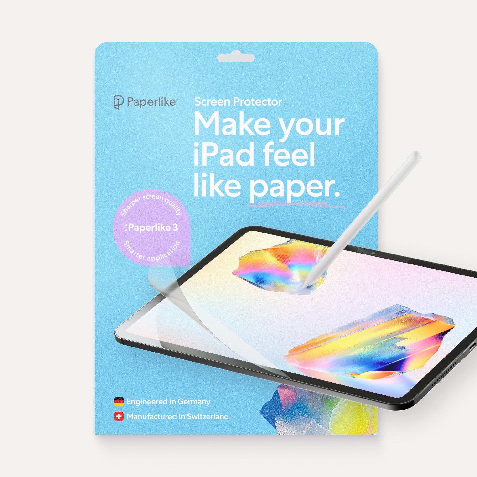
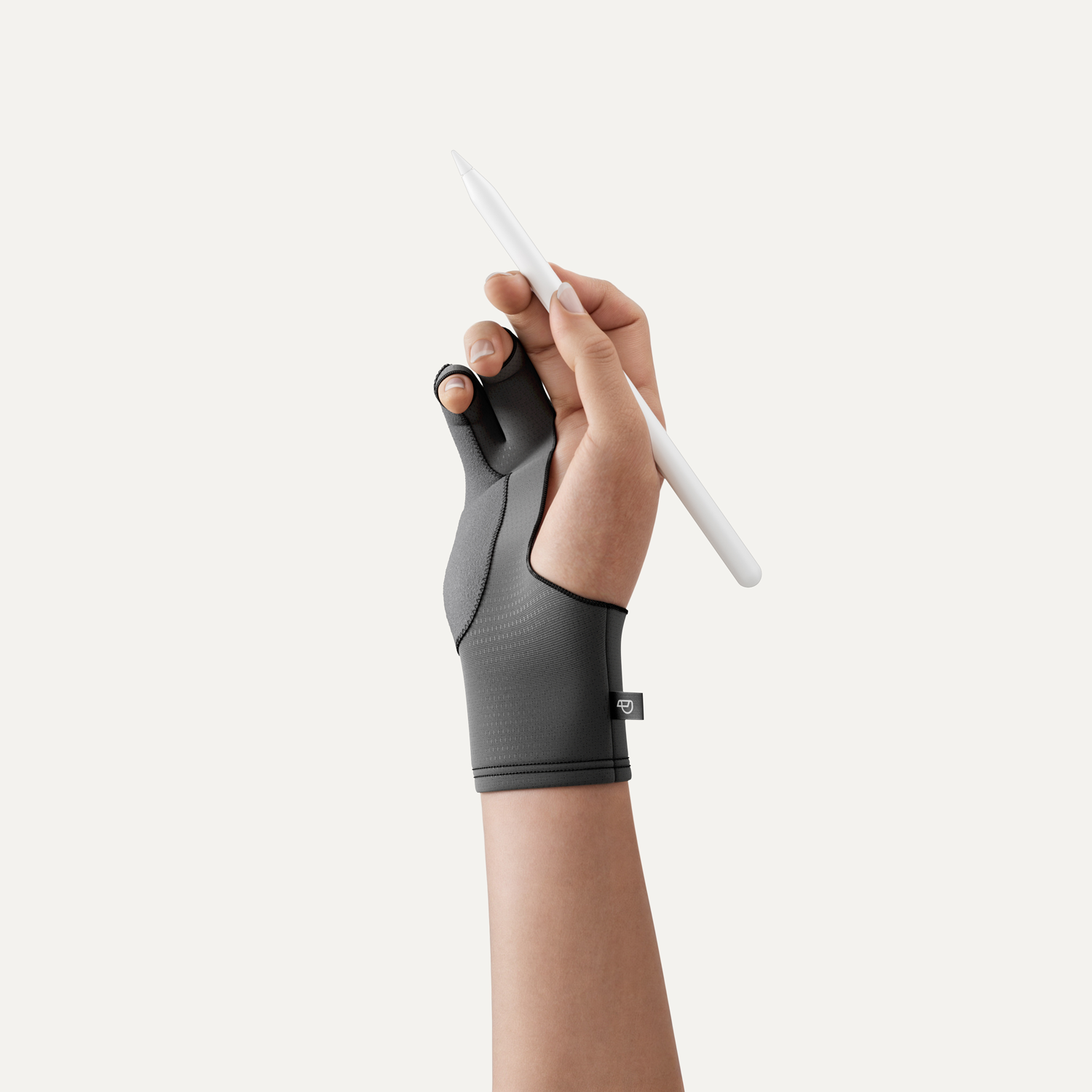
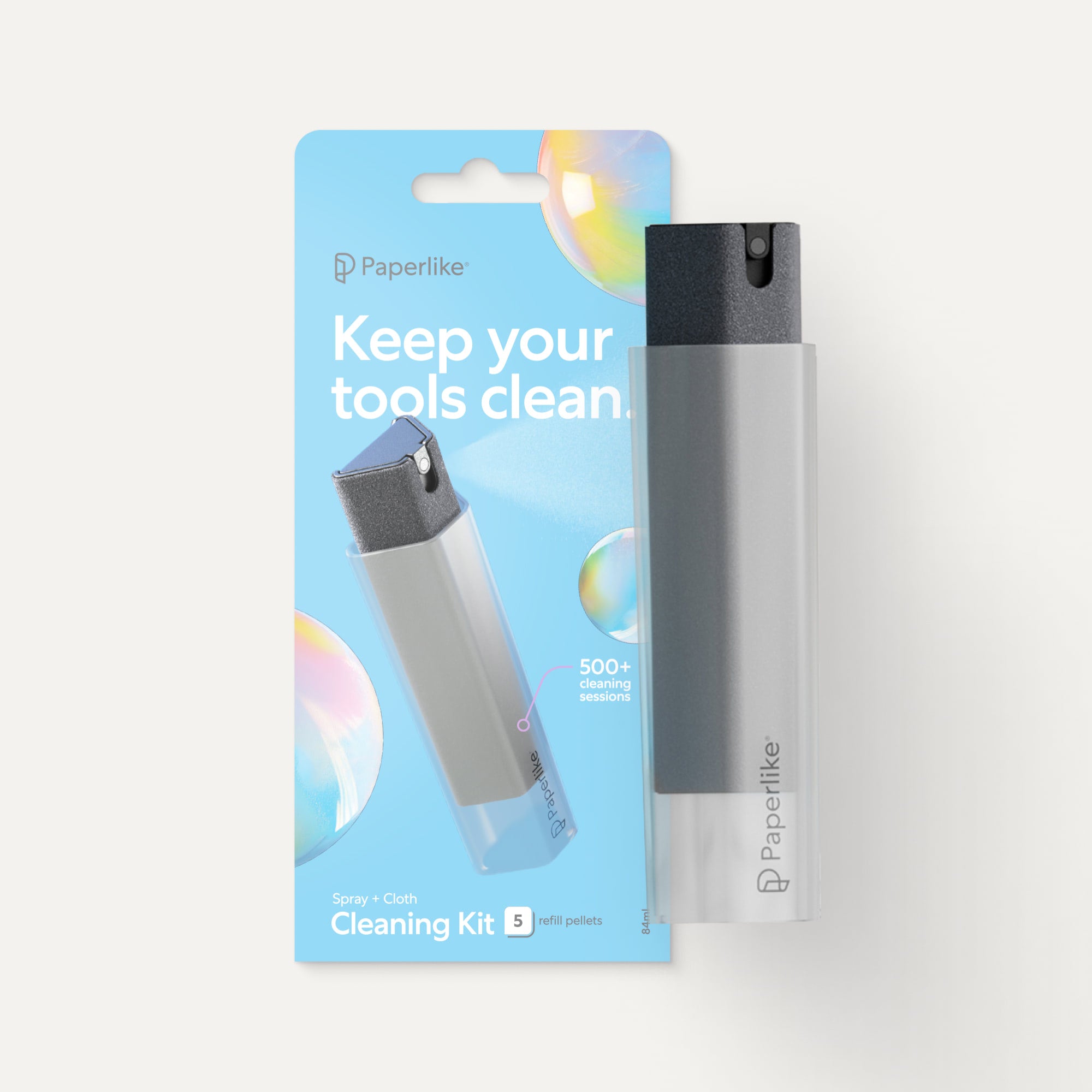
Going digital? Paperlike can help!
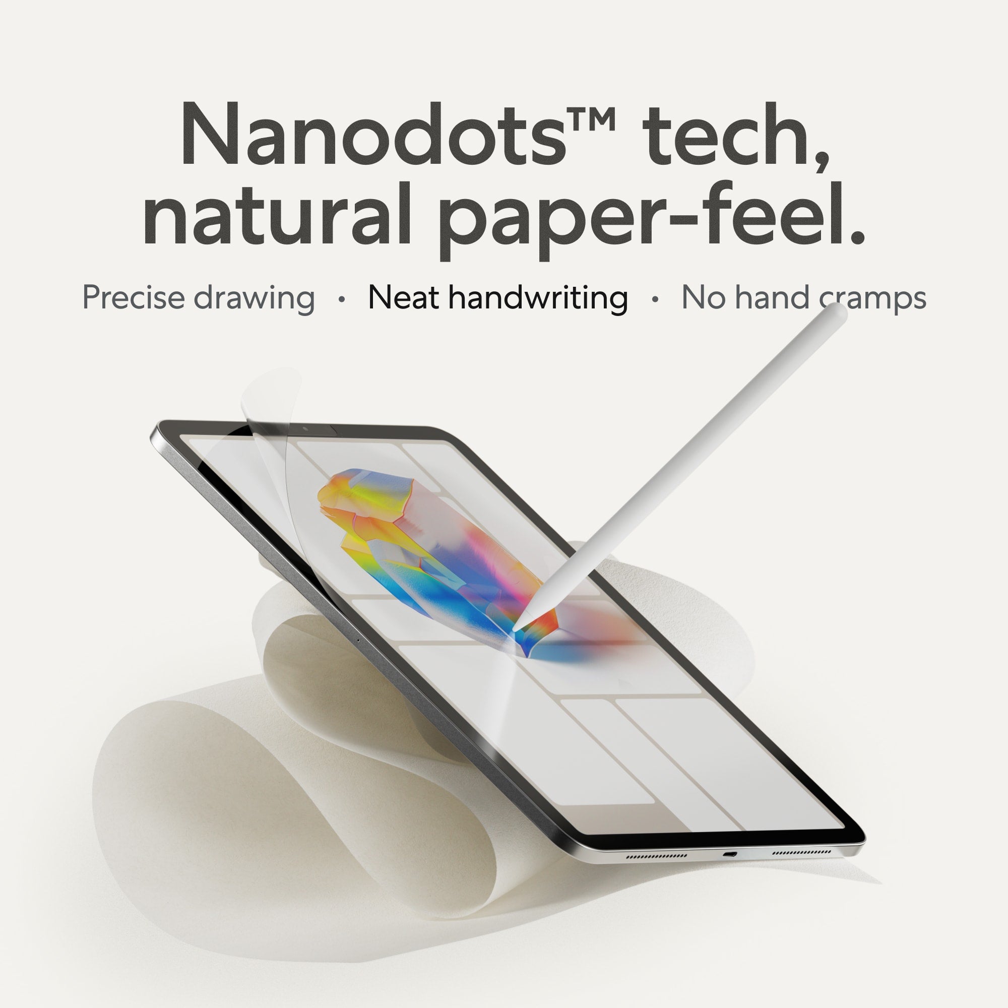
One of the major disadvantages of going digital is the screen. iPads and other digital tablets use glass screens that are slick to the touch.
This makes the surface difficult for drawing because the stylus can slip and slide across the glass!
Paperlike solves this problem. Our Screen Protector adds friction and resistance to your screen so that it feels just like real paper. This is great for artists coming from traditional mediums who want the best of both worlds.
Get your Screen Protector today!

03. Hand lettering terminology
In earlier sections, we talked about the basics behind hand lettering and the tools you need in order to get started.
Now, let’s take a look at some basic hand lettering terminology that you’ll want to know while working to master the art of hand lettering.
We’ll keep this glossary short and sweet so that you can find what you need and get back to work, but be sure to check out our linked resources for even more information on fonts, positioning, and lettering anatomy.

Fonts and typefaces
As you probably know, fonts aren’t exclusive to hand lettering. The term “font” actually comes from metal typesetting and is generally interchangeable with typefaces when describing its particular size, weight, and style.
Why does this matter to a hand letterer? Because fonts are both a great source of inspiration and an effective guideline when creating your own unique letters.
Whether you need to modify an existing typeface or create one of your own, browsing a font library like Google Fonts can help you gather ideas and best determine how your font fits within modern categories. Let’s look at the basics:

Sans-serif fonts have no embellishments or extended features at the end of the stroke. These fonts are straight, simple, and no-nonsense. Roboto and Montserrat are great examples of sans-serif fonts.
Serif fonts feature extensions at the end of each stroke. These small additions create definition and shape within the typeface. Take a look at Josefin Slab and Merriweather to see a good example of the serif extensions in the typeface.
Script typefaces often resemble handwriting and are typically used in display format rather than for text copy like what you’d see in a newspaper or online article. These typefaces are wildly varied, as displayed here by the Long Kang and Bad Script styles.
There are other fonts styles, like display styles and monospaced styles, but even these fall under the broader categories listed above. Scripts are particularly useful for hand letterers who want to mimic a calligraphic style or who want to use brush pens to style their strokes.
As a letterer, keep an eye out for unique styles and typefaces on everything from advertising emails to film reels. Everyone uses lettering for something, and you never know where inspiration might strike.
Positioning
In hand lettering and design, it’s important to know how to position your letters on the page.
While the Adobe Print Publishing Technical Guide has an exhaustive list of letterform anatomy, we’re going to cover the basics here and add a few other useful terms to supplement your hand lettering knowledge.

- Baseline - This is the line on which the majority of characters in the typeface sit. If you drew a line under every letter of text in this paragraph, you’d see the baseline.
- Cap Line - This is the line that touches the top of every capital letter in a typeface. If you were to DRAW A LINE ACROSS THE TOP OF THIS SET OF CAPITAL LETTERS, you’d see the cap line.
- Median Line - This line runs across the top of non-ascending, lowercase letters. Most (not all) lowercase letters will touch the top of this line without exceeding it.

- Ascender Line - This line serves as a touchpoint for lowercase, taller letters that climb above the median line.
- Descender Line - Marks the lowest point of the descenders within a font or typeface.
- X-Height - The distance between the median line and the baseline of the font. Typically, this is the height of the lowercase x.
- Cap Height - The height of the capital letters within the typeface.
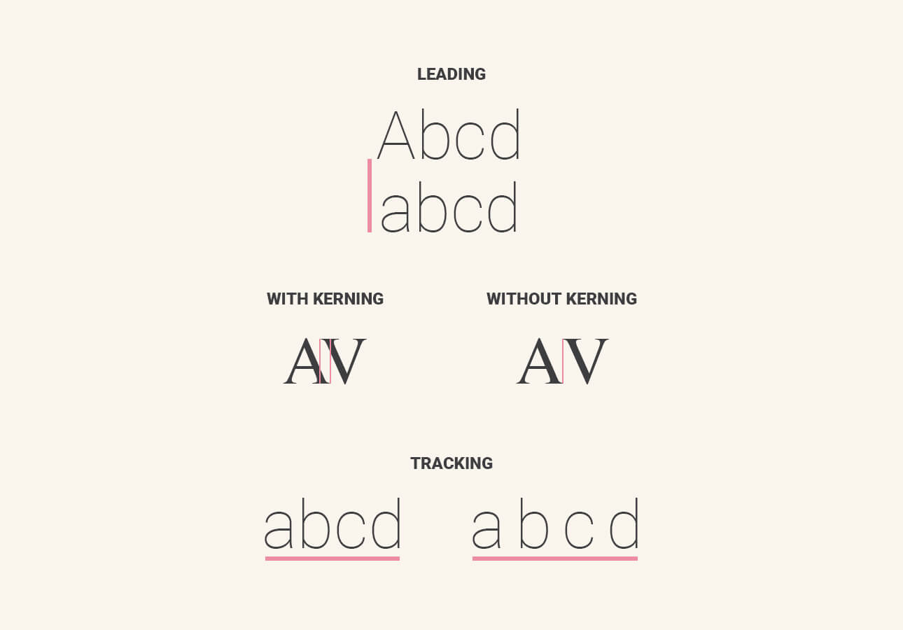
- Leading - Describes the distance between each line of text, which is important for determining the legibility of the text.
- Kerning - The amount of space between two characters within a typeface.
- Tracking - Also called letter-spacing, this describes the overall spacing between groups of letters, often separated by the space bar on modern keyboards.
While typography and typesetting might not be part of your daily hand lettering routine, knowing more about the anatomy of letters and how typography works can improve your lettering technique and show you how to modify your lettering style in new and exciting ways.

Go digital with Paperlike!
One of the biggest advantages that hand letterers can gain by going digital is the ability to quickly modify and experiment with various lettering features.
Many software applications allow artists to work in layers. This makes it easy to resize and reshape letters, kerning, tracking, and more in seconds.
Using Paperlike, you can apply traditional lettering techniques to your artwork and then use digital tools to customize your output.
Lettering anatomy
Mastering the art of hand lettering often comes down to mastering the fundamentals of lettering itself.
Here are a few basic definitions that you’ll want to know about lettering and typography. We’re only covering the basics here, but Visme published a great infographic about the parts of letters.

- Stroke - The basic motion that calligraphers and script letterers use to create letters. The strokes consist of a pushed upstroke and a pulled downstroke.
- Terminal - Typically, the terminal of a letter is the end of a stroke. This may or may not include a serif.
- Stem - The vertical stroke of a letterform. For tall letters like k or h, this is the part of the letter where other components are attached.

- Ascender - Describes the part of a letter that climbs above the median line. The portion that exceeds the median.
- Descender - Describes the part of the letter that dips below the baseline. The portion that breaks the baseline.
- Counter - The enclosed or partially-enclosed negative space within the letter. The space within the line of letter O is considered a counter.
- Embellishment - Whorls, swirls, and other decorative flourishes that stylize a letterform.

Lettering styles
We briefly touched on lettering styles earlier, but we want to highlight some of the main styles that you’re likely to see employed by modern hand lettering artists.
Every-Tuesday published a great hand lettering style inspiration guide that you should also consider if you’re looking for interesting ways to style your letterforms.
- Brush Lettering - Uses brush pens to create faux calligraphy by using flexible brush tips to manipulate the intensity of the stroke.
- Bounce Lettering - A lettering style used by lettering artists to make the letters look bouncy. When bounce is applied to letterforms, the baseline often varies in height from one letter to the next.
- Chalk Lettering - Hand lettering created using chalk as a medium. Often seen on sandwich boards, in DIY projects, and on chalkboards.
- Crayligraphy - The art of hand lettering applied using Crayola markers and (rarely) crayons.
- Graffiti - While not strictly hand lettering, some graffiti artists employ drawn letters as part of a larger style.

Ready to take your lettering skills to the next level?
Whether you’re just mastering your downstroke or trying to manipulate your text in new and exciting ways, picking up an iPad and an Apple Pencil is a great way to switch up your lettering game.
Combined with the Procreate app and a Screen Protector, you’ll have no limits when it comes to your creative process.

04. The hand lettering creative process
As an art form, hand lettering follows a process that is somewhere between art and design. Let’s cover the broad basics of hand lettering creation.
Keep in mind that your creative style may vary. This is a rough guide, not an ironclad process. Adjust each step as you see fit!
Getting started
Even for the most creative professionals, getting started is often the hardest part. A blank canvas can be intimidating. Here are the basic steps you’ll need to follow to jumpstart your next big lettering piece.

1. Find inspiration
For many artists, the first step to creating a great piece of art has very little to do with the art itself. It’s about being open to the world, connecting with people, and waiting for the ideas to come.
Whether you’re looking at billboards, flipping through magazines, or enjoying a dinner with friends, do what you need to do to find inspiration — but be ready when lightning strikes.

2. Doodle and iterate
Once you have the broad strokes of an idea, it’s time to doodle and iterate.
Most professional letterers we spoke with while building this guide emphasized how important it is to experiment stylistically during this phase. Many told us that it was rare for an idea to emerge fully-formed and ready for the page.
Most of the best ideas require refinement before they’re ready for production. Doodling and sketching are great ways to motivate your brain, iterate on your ideas, and create the best possible outcome before the technical process gets underway.
You can see great examples of sketch iteration in James Martin’s logo design. Each design embodies a company in a different way, but each iteration is one step closer to the final product.
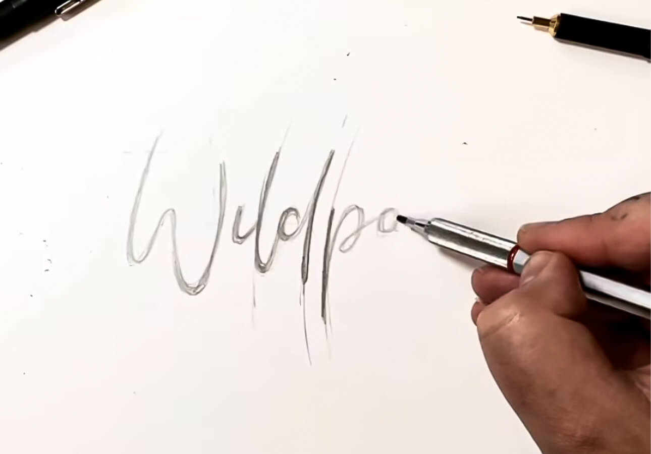
3. Sketch it out
Once you’ve got a solid idea, it’s time to sketch it onto your page.
While this can take place in a digital medium if you’re using an iPad or similar tablet, many lettering artists choose to do this via traditional means before importing their sketch to the drawing app of their choice.
Use your pencil, ruler, eraser, and other tools to get your art onto the page!
Staying traditional
If you’re sticking with pen and paper or other traditional means, you’ll want to stay on this path. Nothing digital is required through the final three stages.

4. Add some ink
Once you’ve added your sketch to your canvas, it’s time to ink the design.
Go over your sketch with a fineliner or other marker (depending on your design) taking care to follow your outlines and to draw your letters with clean straight lines.
This process can take time, but it’s important not to rush. If you make a mistake here, it’s part of the finished product forever. Keep things clean and crisp. Take breaks as needed.

5. Erase your sketch marks
Once you’ve completed the design, it’s time to go back and erase your pencil marks. Use your eraser and rub the page lightly to remove the marks.
Take care at this stage not to tear the page or press too hard. You don’t want to rip it or damage the paper in some way. Keep things light and easy until all the marks are removed.

6. Color and stylize
Now for the fun part. With the sketch outlined, it’s time to add color. Use your markers, pencils, and other tools to add a little color and style to your design!
Going digital
If you’re using a digital tablet like an iPad, you’ll want to prepare to scan your sketch once the essential mockup is complete.
Some artists choose to line their sketch first to make the import process easier. Ultimately, it’s up to you to decide when you should begin the importing process based on the quality of your equipment.

4. Import to tablet
Whether by using your smartphone or tablet camera or a high-quality scanner, you’ll want to import your sketch into the drawing app of your choice.
Many apps allow you to bring this document in as its own layer. Load that layer into a new document, create a layer above it, and lower the opacity of your imported drawing so that it’s barely visible.

5. Redraw and vectorize design
At this stage, you’ll need to redraw your design. This is probably the most tedious part when shifting from analog to digital, but it’s necessary.
Use an in-app pen tool or a physical stylus to sketch over your outline on your new layer. If you want to experiment, consider using multiple layers so that you can warp and transform your design with fine-grained control.
Note that if you want to vectorize your design, Procreate won't work. You'll want to use a vector drawing program like Adobe Fresco or Illustrator. Learn more about the differences between Procreate and Adobe Fresco or Procreate and Illustrator.

6. Add color and style
Once you’ve got a working outline, use the color tools within your app of choice to colorize and stylize the image.
Many apps come with interesting gradient effects, paint mixing, and other customization features that allow you to make interesting color combinations in seconds. Take advantage of these features to make your art shine.
Related
- 30+ Best Procreate Color Palettes.
- 20+ Procreate Fonts & How to Use Them.
- 5 Best Procreate Brush Sets for Lettering Artists.
7. Finalize and save
When you’ve wrapped up, remove any basic layers, and compress your design.
Don’t forget to save a copy in the app’s native format (if necessary) so that you can open up the layered file again at a future date for additional revisions and iterations.
Share it!
Once you’ve finished creating your design, it’s time for the most important part: Sharing it with the world.
We spoke with multiple hand lettering experts while creating this content. Every one of them told us that without sharing their artwork, they wouldn’t have gotten to where they are today.
We totally understand that sharing your art might not be the best part of the creation process, especially if you’re not a big fan of social media platforms, but sharing feeds the community and inspires others.
Why not contribute and join in the fun?

Looking for extra inspiration?
Finding inspiration can be hard!
That’s why we work hard to feature the very best artists via Paperlike on Instagram. Come be a part of our community and liven up your feed with fresh art from world-class creatives from all over the world.

05. Wrapping up / close
And there you have it! Everything you need to know in order to get started with basic hand lettering.
While this is by no means an exhaustive list, we hope the content provided here can help you figure out where best to start with lettering.
Want to know more? Be sure to check out our creative resources for hand letterers, some of our interviews with lettering experts, and our guide on switching from traditional to digital hand lettering!
And don’t forget: If you’re working on an iPad, a Screen Protector by Paperlike has been a game-changer for artists all over the world.
Protect your screen and improve your art with Paperlike. Grab one today!
